The Golden State Warriors are basically the gold standard of the modern NBA, but if you look at their jerseys from thirty years ago, you’d barely recognize the brand. It’s wild. Most fans today see the sleek blue and gold circle with the Bay Bridge and think that’s just how it’s always been. It isn't. The journey of the old Golden State logo is actually a messy, fascinating timeline of identity crises, localized pride, and some really questionable 90s design choices that somehow became cult classics.
When the team moved from Philadelphia to San Francisco in 1962, they weren't even the "Golden State" Warriors yet. They were the San Francisco Warriors. They wore these bold "The City" jerseys featuring a cable car on the front and a bridge on the back. It was iconic. Honestly, it’s probably the best logo in sports history, but for some reason, the front office decided to pivot in 1971. That’s when the "Golden State" moniker was born, a move intended to make the team feel like it belonged to the entire region rather than just one side of the bridge.
The Blue Circle and the California Map
From 1971 to 1997, the Warriors rocked what many purists consider the definitive old Golden State logo. It was simple. You had a blue circle, a yellow outline of the state of California, and a star marking the Bay Area. It felt honest. It didn't try too hard. During this era, players like Rick Barry and Jamaal Wilkes brought a championship to the Bay in '75, cementing that specific imagery in the minds of a generation.
There’s something about that logo that screams "vintage NBA." It wasn't about flashy marketing or "synergy." It was a map. Literally. If you didn't know where the team played, the logo told you.
But then the 90s happened. Everything changed.
The league was moving toward a gritty, aggressive aesthetic. Think about the Phoenix Suns "burst" logo or the Detroit Pistons "teal horse." The Warriors felt left behind. They wanted something that looked "tough." This led to what many fans affectionately (or derogatorily) call the "Thunder" era.
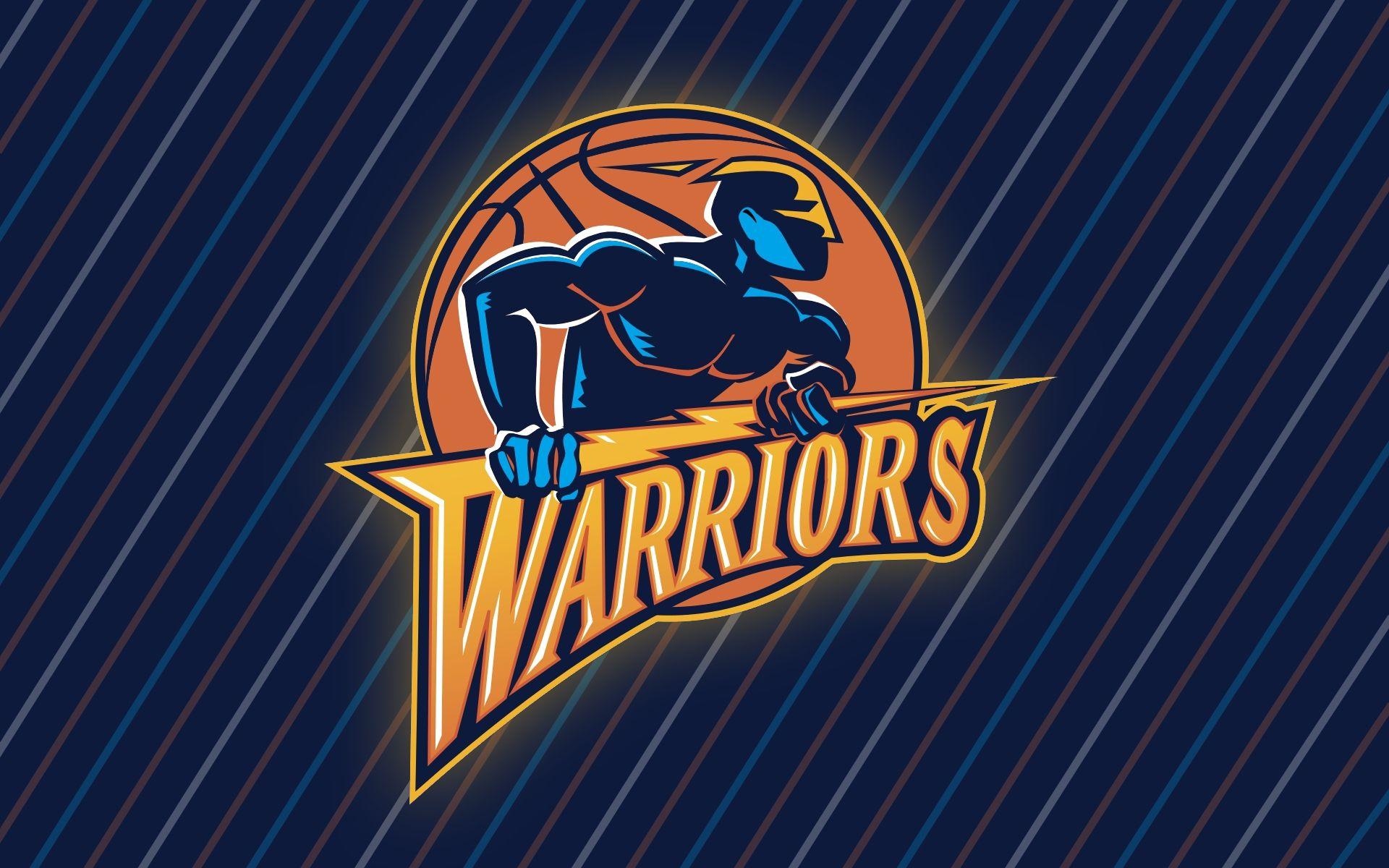
The Lightning Bolt Era: 1997–2010
In 1997, the Warriors dropped the map and the classic blue and yellow. They went dark. Navy blue, orange, and a weird shade of red-gold took over. The new old Golden State logo featured a muscular, masked character clutching a lightning bolt. It was aggressive. It was very 1997.
Actually, let's talk about that character. Most people called him "Thunder," but he wasn't technically the logo—he was the mascot that represented the logo's energy. The logo itself was a stylized "W" with a lightning bolt cutting through it. For a decade, this was the face of a team that was, frankly, pretty bad. Except for 2007.
You remember the "We Believe" team? Baron Davis, Stephen Jackson, Jason Richardson. They took down the number one seed Dallas Mavericks in one of the biggest upsets in playoff history. Because of that one magical run, a logo that probably should have been forgotten became legendary. You see those jerseys at Chase Center all the time now. It’s nostalgia for a time when the team was an underdog, a stark contrast to the dynasty years.
Why the Design Shift Happened
Logos don't just change because a designer gets bored. It’s usually about money and identity. By the late 2000s, the Warriors were languishing. The lightning bolt felt like a relic of a failed era. When Joe Lacob and Peter Guber bought the team in 2010, they knew they needed a hard reset. They wanted to go back to the roots.
They looked at the old Golden State logo from the 60s—the "The City" logo—and modernized it. They brought back the blue and gold. They brought back the bridge. They realized that the "Golden State" identity worked best when it felt connected to the geography of the Bay, not some vague superhero aesthetic.
Interestingly, the 2010 redesign was initially hated. People on social media (which was still relatively young then) complained that the new bridge logo looked like a "copper coin" or was too "corporate." It’s funny how winning four championships makes a logo look like a masterpiece.
Breaking Down the Versions
- 1962–1971: The San Francisco era. Cable cars and the Golden Gate Bridge. High contrast, very "60s cool."
- 1971–1997: The California map. This is the old Golden State logo that lived through the 1975 title. It’s the "classic."
- 1997–2010: The "Thunder" era. Navy blue and orange. A total departure from everything that came before.
- 2010–Present: The Bay Bridge circle. A return to the roots but with modern lines.
The Cultural Impact of Throwback Gear
You can’t talk about the old Golden State logo without talking about Mitchell & Ness. The throwback market is huge. Why? Because sports fans are tribal. Wearing a 1991 Chris Mullin jersey with the California map logo isn't just about fashion; it's a way of saying, "I was here before the Curry era." It's a badge of honor for those who sat through the lean years at Oracle Arena.
There is a specific texture to those old logos. The screen-printing was different. The colors were slightly more "primary." When you see that yellow map on a blue background, it evokes a specific feeling of West Coast basketball that the modern, polished brand can't quite replicate.
There's also the weird legal limbo of the mascot. "Thunder" was retired because the Oklahoma City Thunder joined the league in 2008. The Warriors couldn't really have a mascot named Thunder when another team was the Thunder. It's one of those weird footnotes in NBA history that makes the 2000s logo feel even more like a "lost" era.
Practical Takeaways for Collectors and Fans
If you're out there looking to score some gear featuring the old Golden State logo, you've got to be careful. The market is flooded with "fakes" that get the colors wrong. The "California gold" of the 70s is very different from the "orange-gold" of the early 2000s.
- Check the tags. Genuine vintage pieces from the 80s will usually be Champion or Sand-Knit.
- Look at the "W." In the 97-10 logo, the lightning bolt should have a very specific sharp angle. Bootlegs often round those edges off.
- The map logo from the 70s and 80s should have the star precisely over the Bay Area. Some cheap reprints accidentally put the star closer to Sacramento or even Los Angeles. That's a dead giveaway.
The evolution of the Warriors' look is a lesson in branding. It shows that you can't just chase trends. The 1997 logo was a trend-chaser, and while it has fans now, it didn't have staying power. The current logo works because it acknowledges the history of the old Golden State logo while looking toward the future. It’s a bridge—literally and figuratively.
Next time you see a fan wearing that navy blue jersey with the lightning bolt, don't just think of it as a "failed" design. Think of it as a piece of the puzzle that led to one of the greatest dynasties in the history of the sport. It’s all part of the story.
To really appreciate where the brand is now, you have to look at the eBay listings for 1975 championship pennants or 2007 playoff shirts. That's where the soul of the franchise lives. It's in the stitches of those old, slightly ugly, wonderfully weird logos.
The best way to engage with this history is to look for "Hardwood Classics" releases. These are official NBA re-issues that use the exact color palettes of the old Golden State logo eras. They aren't cheap, but they are accurate. If you're a real fan, having at least one "Map" shirt and one "Thunder" shirt is basically mandatory for the collection. It covers the full spectrum of the Bay Area's basketball journey.
Actionable Next Steps:
- Audit your collection: Check your vintage gear against the official year-by-year color palettes to ensure authenticity.
- Research "The City" origins: Look into the 1966 jersey design by Franklin Mieuli, which set the template for every bridge-related logo the team has used since.
- Support local: Many Oakland-based creators still make "unauthorized" apparel that pays homage to the 90s-era logos with a street-style twist that the official NBA store lacks.