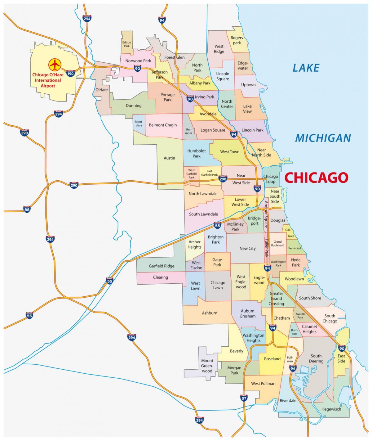
If you’re looking at a Chicago crime map by neighborhood, you’re probably trying to solve a puzzle. Maybe you just landed a job at a firm in the Loop. Or maybe you're eyeing a greystone in Logan Square but someone’s aunt from the suburbs told you it’s "dangerous." It’s complicated. Chicago isn’t a monolith. It’s a patchwork of 77 distinct community areas, and the data often tells a story that the evening news misses. Honestly, looking at a sea of red dots on a digital map can be terrifying without context.
Chicago has a reputation. You know it, I know it. But here’s the thing: crime in the city is hyper-localized. You can be on a block that feels like a quiet European village, walk three blocks south, and find yourself in a different world. That’s why a neighborhood-level breakdown matters more than city-wide averages.
Understanding the Chicago Crime Map by Neighborhood
When you pull up the Chicago Police Department’s CLEAR (Citizen Law Enforcement Analysis and Reporting) system or look at independent trackers like City Bureau, the first thing you notice is the "L" shape. For decades, researchers have pointed out that investment and safety tend to follow the lakefront and the North Side.
The Chicago crime map by neighborhood usually shows lower rates of violent crime in places like Lincoln Park, Lakeview, and Edison Park. But don’t let the colors fool you into thinking it's all about "good" vs "bad" areas. Property crime is a different beast. In high-traffic areas like the Near North Side (think River North and the Magnificent Mile), theft and retail robbery are actually quite high because that’s where the people—and the money—are.
Why the North Side looks so different
Take a look at Lakeview. It’s home to Wrigley Field. On a Saturday night, it's packed. Most of the "crime" here involves someone having one too many Old Styles and getting into a scuffle, or maybe a bike being lifted from a porch. It’s a far cry from the systemic issues seen elsewhere. However, even in these "safe" zones, carjackings became a major talking point in 2024 and 2025, hitting neighborhoods that previously felt immune. It changed the vibe. People are more alert now, even in the Gold Coast.
The South and West Side reality
It’s impossible to talk about the Chicago crime map by neighborhood without addressing the South and West Sides. Neighborhoods like Englewood, North Lawndale, and East Garfield Park consistently show higher rates of violent crime. But here is what people get wrong: it’s not the whole neighborhood. It’s often specific corners or specific blocks. The University of Chicago’s Crime Lab has done extensive work showing how "hot spots" are incredibly small—sometimes just a few addresses.
If you're looking at a map and see a dark shade over Austin, remember that Austin is huge. It has beautiful historic homes and tight-knit blocks where neighbors look out for each other. The data is a tool, not a total verdict on a community’s soul.
Property vs. Violent Crime: The Great Divider
You’ve gotta distinguish between the types of incidents. It's vital.
- Violent Crime: Homicide, robbery, aggravated battery. These are the stats that drive the headlines.
- Property Crime: Burglary, motor vehicle theft, larceny.
If you’re looking at a Chicago crime map by neighborhood for a place like Wicker Park, you might see a lot of activity. Is it dangerous? Not necessarily in the way people fear. It’s often "lifestyle" crime. Package thieves are a plague there. Catalytic converter thefts? Huge. But you’re likely safe walking to get a coffee at 10:00 AM.
Compare that to a neighborhood like West Englewood. The total number of incidents might actually be lower than the Loop because there are fewer businesses and less foot traffic, but the severity of the crimes—shootings or domestic violence calls—is higher. That’s the nuance a simple color-coded map often fails to convey.
How to Read the Maps Without Panicking
Don't just look at the dots. Context is king.
First, check the population density. A map that doesn't account for how many people live in a square mile is basically useless. The Loop always looks like a crime den on maps because the resident population is small compared to the millions of commuters and tourists passing through. Of course there’s more crime where there are more people.
Second, look at the trends. Is crime going up or down compared to last year? The Chicago Police Department releases weekly "CompStat" reports. These are gold. They tell you if a specific district is seeing a spike in burglaries, which might mean there’s a specific crew working that area. It’s more actionable than knowing the 10-year average.
Third, consider the time of day. A Chicago crime map by neighborhood rarely shows you that most violent incidents happen late at night or in the early morning hours. If you’re a 9-to-5 commuter, the "danger" level of a neighborhood during your active hours is a fraction of what the 24-hour data suggests.
The Role of "The L" and Transit Safety
Chicago is a transit city. If you're using a crime map to pick an apartment, you need to look at the stations. The CTA has had its struggles lately. Over the last two years, there’s been a lot of digital ink spilled about safety on the Red and Blue lines.
The crime map near the Red Line stop at 79th Street looks a lot different than the one at Addison. But even at "safe" stops like Clark/Lake, the concentration of incidents is higher than the surrounding blocks. Transit hubs are magnets. If you're moving here, look at the map for the two blocks around the train station you'll be using. That’s your real daily experience.
Real Talk: Is it "Safe"?
Safety is a feeling, not just a number. Honestly, some people feel perfectly fine in a "yellow" zone on a crime map because they know their neighbors. Others feel terrified in a "green" zone because they saw a suspicious car.
I’ve lived in neighborhoods that look "scary" on a Chicago crime map by neighborhood and never had an issue. Why? Because I wasn't involved in the specific sub-cultures where the violence usually stays contained—mostly related to the drug trade or long-standing gang disputes. For the average resident, the biggest threat is often just being in the wrong place at the wrong time during a robbery attempt.
Surprising Safe Havens in the City
There are neighborhoods that fly under the radar. They don't make the "Best Neighborhoods" lists often, but their crime maps are boring. Boring is good.
- Forest Glen: Up on the Northwest Side. It’s basically Mayberry. Low density, lots of city workers (cops and firefighters), and almost no violent crime.
- Mount Greenwood: On the Far South Side. Similar vibe. It’s a "blue" neighborhood in more ways than one. Very safe, though it can feel a bit isolated from the downtown hustle.
- Edgewater: Right on the lake, north of Uptown. It’s dense, it’s diverse, and while it has its moments, it’s remarkably stable for how much is going on there.
Actionable Steps for Using Crime Data Effectively
If you are actually using a Chicago crime map by neighborhood to make a life decision, don't just stare at the screen. Use these steps to get the real story.
1. Filter by "Part 1" Crimes Only
Don't get bogged down in "public peace violations" or "gambling." Those clutter the map. Focus on the stuff that actually affects your safety: robbery, aggravated battery, and burglary.
2. Use the "Street View" Hack
Find a "hot spot" on the crime map. Now, go to Google Street View and look at that corner. Are there boarded-up buildings? Is there a liquor store with a lot of loitering? Or is it a busy intersection with a lot of legitimate foot traffic? This helps you understand if the "crime" is environmental or random.
3. Join the Local Facebook or Reddit Groups
Go to the r/chicago subreddit or neighborhood-specific groups. Ask: "I see a lot of activity on the crime map near [Intersection], what’s the actual vibe there?" Locals will tell you. "Oh, that’s just a rowdy bar that gets police called once a week," is much less scary than "Yeah, there have been three muggings there this month."
4. Check the "Clearance Rate"
This is a bit more advanced. Look at how many crimes in that neighborhood actually get solved. In some North Side areas, the police presence is higher, and the clearance rate (arrests made) is better. In some South Side neighborhoods, the lack of trust in police leads to lower clearance rates, which can unfortunately embolden repeat offenders.
5. Visit at Night
This is the golden rule. A neighborhood can look great at 2:00 PM on a Tuesday. Go back at 10:00 PM on a Friday. Is it well-lit? Are people out walking their dogs? If the streets are deserted and you feel a prickle on the back of your neck, the crime map doesn't matter. Your gut does.
Chicago is a city of neighborhoods. It always has been. The Chicago crime map by neighborhood is just one layer of the story. It doesn't show the block parties, the world-class food, the lakefront path, or the incredible resilience of the people who live here. Use the data to be smart, but don't let it keep you from experiencing what the city has to offer. Just keep your head on a swivel, don't leave your car running while you run into a 7-Eleven, and for the love of everything, don't leave your laptop bag in plain sight in your parked car. That's just asking for a "property crime" statistic to be named after you.
What to do next
Start by visiting the Chicago Police Department's Data Portal. Select your specific neighborhood and filter for the last 90 days. This gives you the most relevant, recent snapshot of what's happening on the ground right now, rather than outdated annual reports. Combined with a physical visit to the area during evening hours, you'll have a better understanding of the area than any algorithm can provide.