Ever looked closely at the Chicago Bulls logo? Like, really looked? It’s been exactly the same since 1966. In a world where tech giants change their fonts every six months because a focus group got bored, the Bulls are out here rocking the same red-tipped horns Dean Wessel drew up nearly sixty years ago. It’s arguably the most stubborn piece of graphic design in professional sports. Honestly, it’s beautiful.
But the rest of the league? They can’t stop tinkering.
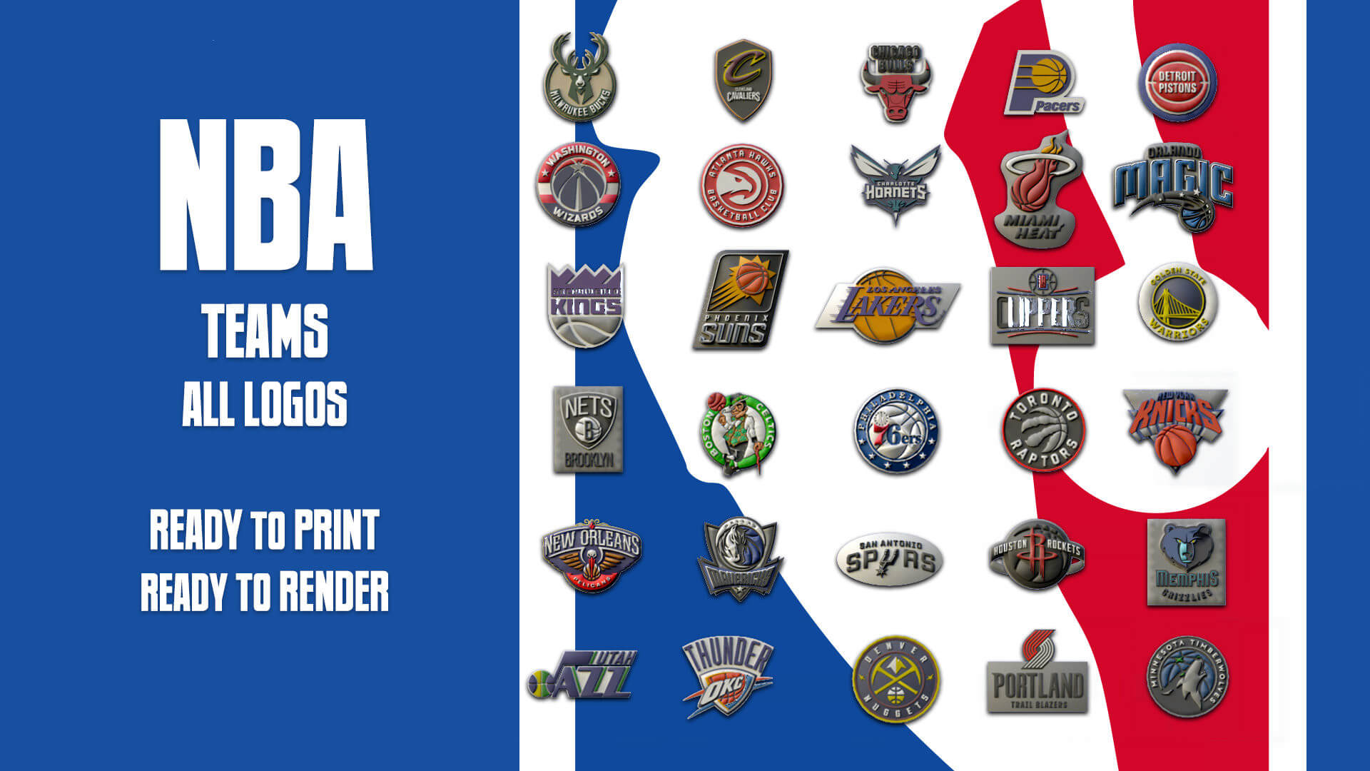
When we talk about all nba teams logos, we aren't just talking about symbols on a jersey. We're talking about a multi-billion dollar tug-of-war between nostalgia and the "modern" look. You’ve got teams like the Celtics who treat their leprechaun like a holy relic, and then you have the Utah Jazz, who seem to change their entire identity every time the wind blows differently in Salt Lake City.
The Minimalist Trap and the Return to Retro
Right now, in 2026, we’re seeing a weird shift. For about a decade, every team wanted to be "clean." They stripped away the 90s jagged edges, killed the gradients, and went for these flat, circular badges. The Brooklyn Nets basically started it when they moved from Jersey—black, white, a shield, and a ball. Simple. Efficient. Kinda corporate, if we're being real.
But lately, the vibe is shifting back. People missed the "soul" of the old-school designs. The Orlando Magic just went through a massive refresh for the 2025-26 season that basically admitted the 90s were better. They brought back the pinstripes and a modernized version of the classic ball-and-stars logo. It turns out, fans don't want a "streamlined brand experience." They want the logo they grew up watching on a grainy CRT television.
Why the Basketball is Everywhere
If you look at all the primary logos across the league, a staggering number of them—21 out of 30—feature an actual basketball. Why? It feels a bit on the nose, doesn't it? You don't see NFL logos with a football in the background every time.
The reason is actually pretty practical: balance. A basketball is a perfect circle. For a designer, that’s a "cheat code" for creating a balanced emblem. It provides a frame for the team name or a mascot. Take the Los Angeles Lakers. It’s just text over a ball. But that specific "Forum Blue" and Gold? It’s royalty. It’s Hollywood. Even though there are basically zero lakes in LA, the brand is so strong they’d never dream of changing the name or the core mark.
Stories Hidden in the Negative Space
Some of these designs are smarter than they look at first glance. You've probably seen the Milwaukee Bucks logo a thousand times, but did you notice the "M" in the chest hair of the buck? Or the fact that the space between the antlers is shaped like a basketball?
These little "Easter eggs" are what separate the legendary logos from the ones that get replaced in five years.
- The Atlanta Hawks: Their "Pac-Man" logo is a classic example of a design being so good it had to come back. They ditched it for a realistic hawk for a while, but it lacked personality. The current version is a throwback to that 80s silhouette.
- The Houston Rockets: Their "R" looks like a rocket taking off, but it also doubles as a basketball hoop.
- The Dallas Mavericks: That horse head has a "M" hidden in its mane.
- The Golden State Warriors: It’s just the Bay Bridge. But the simplicity is what makes it work for a global brand. It’s not a mascot; it’s a landmark.
The 90s Identity Crisis
We have to talk about the 90s. It was a wild time for all nba teams logos. The Toronto Raptors had a literal red dinosaur dribbling a ball. The Detroit Pistons had a horse made of exhaust pipes and fire. The Charlotte Hornets had a teal bug wearing sneakers.
At the time, traditionalists hated them. They called them "cartoonish." But look at the secondary logos today—teams are leaning back into those "cartoony" marks for their City Edition jerseys and merchandise. Why? Because the generation that grew up with the "Big Logo" era now has the buying power. Nostalgia is a hell of a drug, and the NBA knows exactly how to dose it.
The Teams That Refuse to Change
The "Big Three" of logo consistency are the Bulls, the Celtics, and the Lakers.
- Chicago Bulls: As mentioned, zero changes since '66. It represents the Jordan era, and touching it would be sacrilege.
- Boston Celtics: Lucky the Leprechaun was designed by Zang Auerbach (brother of the legendary Red Auerbach). He’s been spinning that ball since the early 60s. Even when they do "Gold" editions or alternative jerseys, the core identity is untouchable.
- San Antonio Spurs: They moved from the "Fiesta" colors (pink, orange, teal) back to the simple Silver and Black spur. It’s the "Spurs Way"—no frills, just winning.
What’s Next for NBA Branding?
As we move further into 2026, expect to see more "dynamic" logos. With the rise of digital-first branding, logos aren't just for hats anymore; they’re for social media avatars and tiny smartphone screens. This means we might see more "secondary" marks—smaller, simpler versions of the main logo—taking center stage.
The "Debut Patch" program started by Topps in 2025 has also added a new layer to the jersey. Now, the NBA Logoman—the iconic Jerry West silhouette—is being rendered in gold for award winners. It’s a small tweak, but it shows the league is finding new ways to make the logo itself a status symbol.
How to Evaluate a Logo Redesign
If your favorite team is rumored to be changing their look, look for these three things:
- The Silhouette Test: If you blacked out the whole logo, could you still recognize the team just by the shape? (The Bulls and Mavs pass this easily).
- Color Ownership: Does the team "own" those colors? When you see Purple and Orange, you think Suns. When you see Wine and Gold, you think Cavs. If a team moves toward "Generic Blue," they’re losing.
- Local Tie-ins: Does it actually mean something to the city? The Denver Nuggets’ mountain peaks mean something. The 76ers’ 13 stars (for the colonies) mean something.
Whether you're a die-hard fan or just someone who likes cool hats, the evolution of all nba teams logos is a masterclass in how to manage a legacy. It's a balance of honoring the past while trying not to look like a dusty museum exhibit. Sometimes they nail it (like the Grizzlies' move to the navy/light blue), and sometimes they whiff (remember the "S" logo for the Thunder?). But that's the fun of it.
If you want to stay ahead of the curve, keep an eye on the "Statement" and "City" edition leaks that usually drop in late summer. That's where teams test the waters for their next permanent look. You can check the official NBA LockerVision site to see exactly which logos and colors your team is scheduled to wear for the rest of the 2026 season.